Alerts
Provide contextual feedback messages for typical user actions with the handful of available and flexible alert messages.
Examples
Alerts are available for any length of text, as well as an optional
close button. For proper styling, use one of the eight required
contextual classes (e.g., .alert-success).
Below are a few examples of Alerts with their html.
Avatar
The Avatar component is used to represent a user, and displays the profile picture, initials or fallback icon.
Examples
The Avatar component comes in 6 sizes. Starting from 2xl, xl, lg, md, sm and xs. There are different shapes as well to give structures like circle, square.


Badges
Documentation and examples for badges, our small count and labeling component.
Examples
Badges scale to match the size of the immediate parent element by using relative font sizing and em units. Examples of badges containing text, using primary and secondary colors. The badge is applied to its children.
Example of Heading with Badge
New
Example of Heading with Badge
New
Example of Heading with Badge
New
Example of Heading with Badge
New
Example of Heading with Badge
New
Cards
Headwind's cards provide a flexible and extensible content
container with multiple variants and options.
A card is a flexible and extensible content container. It includes
options for headers and footers, a wide variety of content,
contextual background colors, and powerful display options. If
you’re familiar with Bootstrap 3, cards replace our old panels,
wells, and thumbnails. Similar functionality to those components
is available as modifier classes for cards
Examples
Cards are built with as little markup and styles as possible, but still manage to deliver a ton of control and customization. Built with flexbox, they offer easy alignment and mix well with other Bootstrap components. They have no margin by default, so use spacing utilities as needed. Below is an example of a basic card with mixed content and a fixed width. Cards have no fixed width to start, so they’ll naturally fill the full width of its parent element. This is easily customized with our various sizing options.
Card title
Some quick example text to build on the card title and make up the bulk of the card's content.
Images
Documentation and examples for opting images into responsive behavior (so they never become wider than their parent) and add lightweight styles to them—all via classes.
Examples
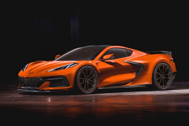
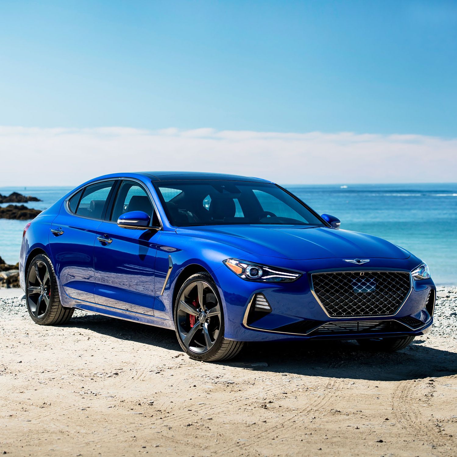
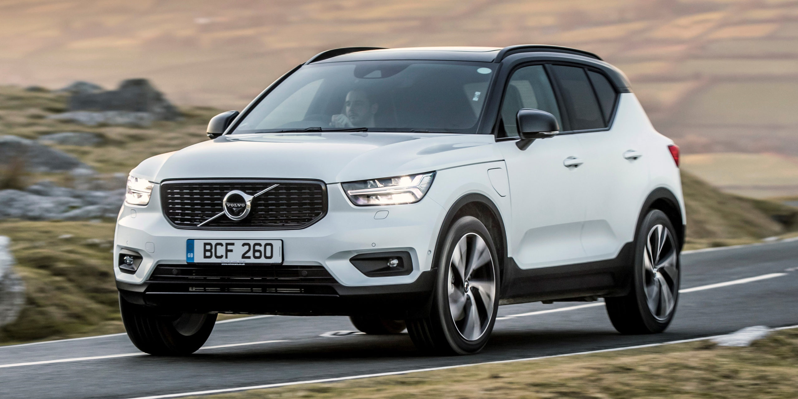
Responsive Images
Images in Headwind are made responsive with .img-responsive. This applies max-width: 100%; and height: auto; to the image so that it scales with the parent width.

Circle Images
Images in Headwind are made responsive with .img-circle.
Inputs
The Input element specifies an input field where the user can enter data. It is the most important form element. It can be displayed in several ways, depending on the type attribute.
Examples
Input Textbox
Input with validation and errors style
Modal
Modals are built with HTML, CSS, and JavaScript. They’re positioned over everything else in the document and remove scroll from the body so that modal content scrolls instead.
Examples
Click on the below CTA to open modal.Modal body containing some text
Toasts
Push notifications to your visitors with a toast, a lightweight and easily customizable alert message.
Examples
Headwind includes several predefined button styles, each serving its own semantic purpose, with a few extras thrown in for more control.